I don’t entirely understand why TTF_SetFontHinting() is having the effect it is, and I wonder whether I’m doing something wrong.
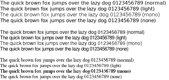
Here are the results I’m getting from the four hinting types (NORMAL, LIGHT, MONO and NONE) for three different fonts. In each case TTF_HINTING_LIGHT is giving subjectively identical results to TTF_HINTING_NONE, which is not what I would have expected:
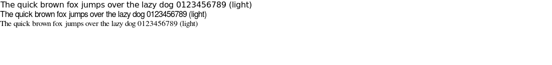
@rtrussell if you zoom in, with some graphic editor, you can see some small difference in gray values even between light and none. This is the hinting !
Indeed there are small differences, here is an animated GIF for comparison:
But given that the documentation says: “the font may become very blurry or messy at smaller sizes” I would have expected a much greater difference. And it surprises me that TTF_HINTING_NONE is most similar to LIGHT rather than NORMAL.
Many generated glyphs are fuzzier but better resemble their original shape.
So Light looks like None.
Then, there is normal which is optimized for standard gray-level rendering.
   *   FT_LOAD_TARGET_NORMAL ::
   *     The default hinting algorithm, optimized for standard gray-level
   *     rendering.  For monochrome output, use @FT_LOAD_TARGET_MONO instead.
   *
   *   FT_LOAD_TARGET_LIGHT ::
   *     A lighter hinting algorithm for gray-level modes.  Many generated
   *     glyphs are fuzzier but better resemble their original shape.  This
   *     is achieved by snapping glyphs to the pixel grid only vertically
   *     (Y-axis), as is done by FreeType's new CFF engine or Microsoft's
   *     ClearType font renderer.  This preserves inter-glyph spacing in
   *     horizontal text.  The snapping is done either by the native font
   *     driver, if the driver itself and the font support it, or by the
   *     auto-hinter.